
If your website visitors can’t find what they’re looking for in five seconds or less, you’re probably losing sales (and fast).
Website navigation isn’t just a design detail. It’s one of the most important parts of your user experience. When done right, it makes your site feel intuitive, professional, and trustworthy. When done wrong? It creates friction, confusion, and bounce rates.
Basically, if you’re going to put in all that marketing work to get people to your site, you better make sure they can find what they’re looking for when they get there!
In this post, I’ll walk you through what great navigation actually looks like, common mistakes to avoid, and smart ways to organize your menu so that customers feel guided every step of the way.

But before I dive in…
Hey there! I’m Whitney, founder of WildHive Studio, where I specialize in branding, packaging, and Shopify website design for product-based businesses.
Over the past few years, I’ve helped dozens of eCommerce brands turn their websites into high-converting, sales-ready machines. My approach blends strategy, structure, and design that goes well beyond “looking pretty”. Navigation is one of the most overlooked parts of that equation, so today, I'm sharing the tips I use every day with my own clients to help them guide their website visitors to take action!
Ok, let’s get into it.
Why Good Navigation Is Critical for Your Website (and Your Business)
First impressions are a make or break moment. Your navigation plays a huge role in that.
Just imagine seeing an ad or a post that teases some juicy content or a product that sounds like exactly what you’ve been looking for. But, when you click the link, you feel like you have to dig, jump through hoops, click, click, and click some more before you actually find what you’re looking for.
And, if you even get to the “click, click, clicking” you’re more patient than most. Statistics show that the average person visiting a new website will close out in just 8 seconds if they aren’t convinced to stay!
But, when you guide your visitors with seamless user experience, it has a big impact on your business:
- It reduces bounce rate by helping people find what they need, fast.
- It builds trust by making your business feel more credible and established.
- It improves conversion rates by creating a smooth path from product (or service) discovery to checkout.
- It boosts SEO when done with clear structure and internal linking in mind.
If you want your website to work for you (not against you), your navigation needs to be doing some heavy lifting.
Common Navigation Mistakes to Avoid on Your Website
Let’s start with what not to do. These common navigation mistakes can cause confusion, overwhelm, or drop-offs:
- Using vague or clever labels: Don’t make people guess what “Magic” or “The Experience” means. Use plain language like “Shop,” “About,” or “Services.”
- Too many main menu items: A crowded navigation bar can overwhelm users. Stick to 5–7 max with 4-5 being the sweet spot.
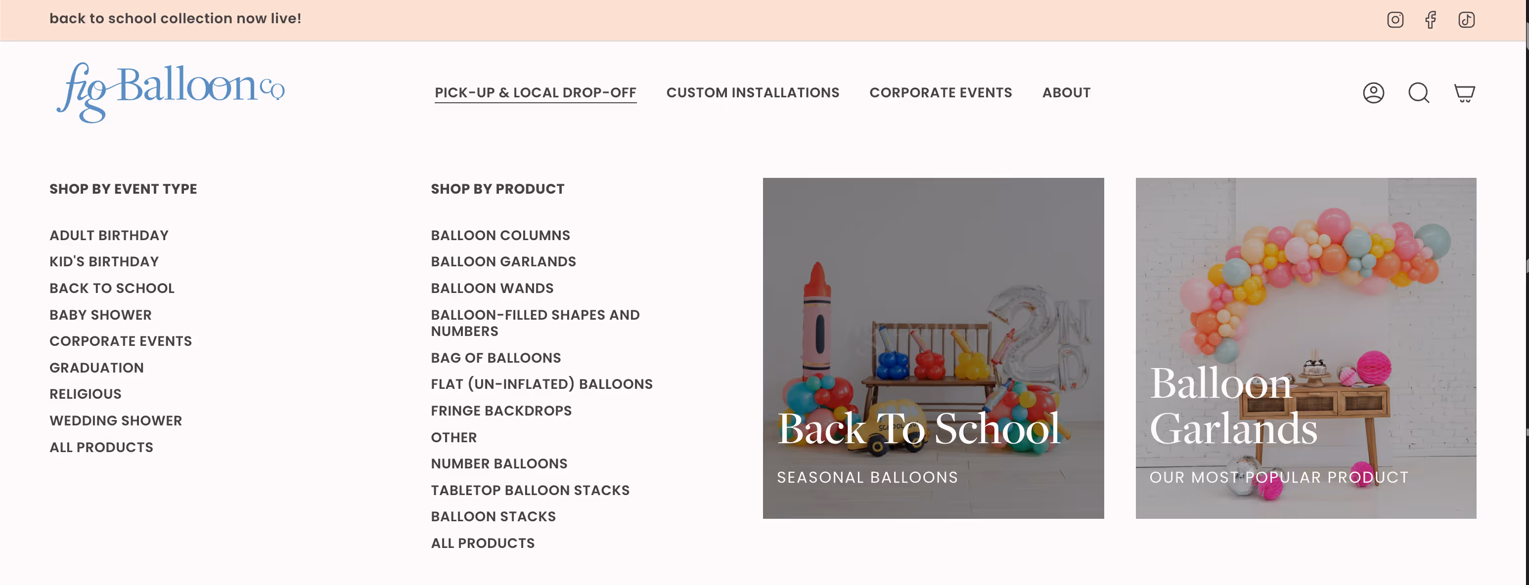
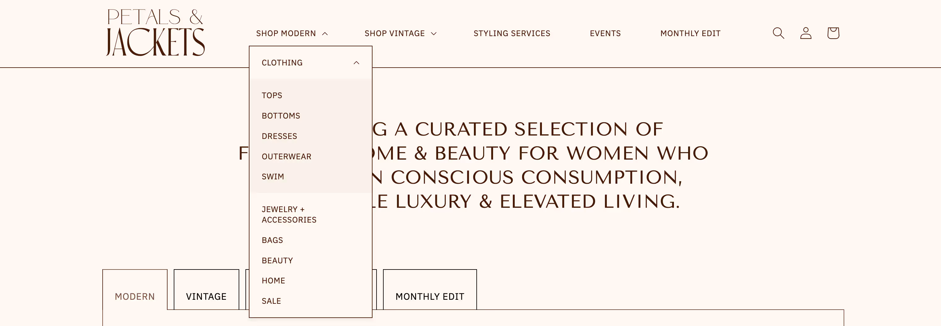
- Overstuffed drop-downs: If your dropdown has more items than a Cheesecake Factory menu, it’s time to simplify. Think about what your customers are really looking for and organize accordingly. For example, are they shopping by Symptom, Gender, Age Group, Gifting Occasion, Season, etc. These are all ways you can organize your vast catalogue into easy-to-navigate collections. Here’s an example of a website with a huge catalog that is organized for an intuitive shopping experience:
- No search bar: Especially for product-based businesses, search is essential.
- Neglecting mobile navigation: Your hamburger menu should be just as strategic and easy to use as your desktop version. Consider building a separate menu just for mobile that reduces the amount of tapping a mobile shopper will have to do.
Okay… But What Should I Include in My Website Navigation?
The exact structure of your website navigation may vary depending on your industry, but most businesses should include these:
- Shop or Services - If you have 1-3 products or services, skip the dropdown and list them out. If you have more than 3, use well organized drop-downs or mega menus)
- About - This can be about the brand’s ethos, you, or your unique approach to your industry. For eCommerce brands with large catalogues, keep the About page link in your footer instead.
- Education, Blog, or Portfolio - Again, this is industry specific, but if your products require education, support, or visual proof, then make sure to include this as well.
- Contact & FAQs - I’m a big proponent of putting FAQs on the bottom of your contact page and using an anchor link. This boosts the word count on your contact page which is great for SEO
- Search bar and/or Account icons (for eCommerce)
- Call to Action Button - this should be your Primary Action, A.K.A. the action you want website visitors to take the most. If your theme or website platform supports having this button in the top right of your navigation, then definitely include it. It could be labeled “Start Here”, “Book a Call”, “Work with Me”, etc.
Call to Action Button - this should be your Primary Action, A.K.A. the action you want website visitors to t
Best Practices for High-Converting Website Navigation
Here’s what separates average websites from the ones that actually convert:
Keep it clear, not clever
Use intuitive labels. Your menu is not the place to be mysterious.
Group related content logically
Drop-downs are helpful—but only if they’re organized.
Limit top-level items
Keep your main nav clean with only the essentials.
Use a call-to-action in the nav bar
Think: “Free Quiz,” “Get Started,” or “Book Now.”

Make it sticky
A sticky nav helps users stay oriented and find what they need, even while scrolling.
Don’t Forget Mobile Navigation
For most websites, over half of website traffic comes from mobile devices, so this step is a must.
Mobile navigation tips:
- Simplify multi-level drop-downs into simple, expandable menus
- Prioritize the most important links first
- Ensure buttons and icons are thumb-friendly (not too small to tap)
- Test on multiple devices to check usability
Pro Tips to Drive More Sales Through Navigation
Once the basics are in place, here’s how to make your nav work harder for you:
- Highlight your best-sellers or most profitable offers
Add a link to your top collections or services.
- Create urgency or excitement
Use nav links like “Back in Stock,” “New Arrivals,” or “Limited Edition.” - Connect Google Analytics or other tracking tools
This helps show you what people are actually clicking on
Test It Like a Beginner (Because Your Customer Probably Is)
You don’t need fancy tools or hours of testing to make sure your website navigation is working. Start simple:
- Open your site on desktop and mobile. Can you find your best-sellers, contact info, or FAQs in under 8 seconds?
- Click through your own menu. Are the drop-downs too overwhelming? Is anything confusing or repetitive?
- Hand your phone to a friend or partner. Ask them to complete a basic task like finding your shipping info or booking a call. Then, here’s the hard part, watch what they do without giving them any clues.
- Bonus round: Give it to your grandma. (Kidding… but also, not really. If Nana can find your best-selling product, so can everyone else.)
Do This One Thing With Your Website’s Navigation (If Nothing Else)
Your website navigation is one of the most powerful tools you have to guide your customer journey and boost your bottom line. However, if you’re feeling overwhelmed by this list of tips and your to-do list, at least promise me you’ll do this one thing.
Add a clear CTA button to your main menu.
Whether it's “Shop Now,” “Book a Call,” or “Get Started,” your navigation should make it very obvious what action you want your visitors to take. This one change can make a big difference in conversions without touching anything else on your site.
Whether you’re a product-based brand or a service provider, a clean, strategic menu can help you reduce friction, increase trust, and drive more conversions.
If you're feeling unsure about your current structure, a quick audit or a few strategic tweaks could make a big difference.
Want help creating a high-converting website with optimized navigation, strategic design, and killer copy?
✨ Check out my VIP Website in a Week service
Did you know Whitney uses Enji to do her own marketing?
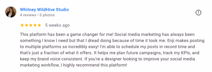
"This platform has been a game changer for me! Social media marketing has always been something I know I need but that I dread doing because of time it took me. Enji makes posting to multiple platforms so incredibly easy! I'm able to schedule my posts in record time and that's just a fraction of what it offers. It helps me plan future campaigns, track my KPIs, and keep my brand voice consistent. If you're a designer looking to improve your social media marketing workflow, I highly recommend this platform!"
Want to try Enji's marketing tools for small business? Use Whitney's referral link to get a discount on your first 2 months if you subscribe!